To be or not to be? To toggle or not to toggle? Should you use accordion, or tab instead? These are the questions we’ll answer in this comprehensive Elementor widgets tutorial.
See this tutorial on YouTube
Firstly, to utilize these widgets, a fundamental understanding of Elementor is necessary. However, you can access them even with the free version of Elementor – no Pro version required. Now, let’s explore these user-friendly widgets and uncover their potential.
Accessing the Elementor Widgets
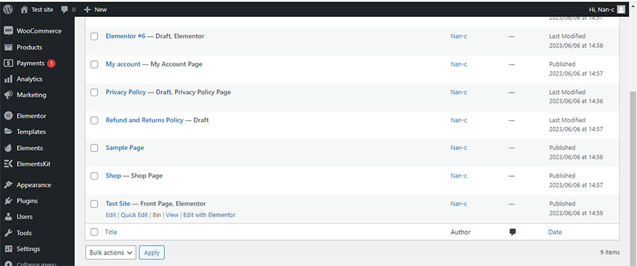
Begin by logging into your Dashboard and navigating to Pages. Suppose you wish to add one or all these widgets to your homepage. Simply select your homepage and click ‘Edit with Elementor’ (Image 1). Here’s where the fun starts.
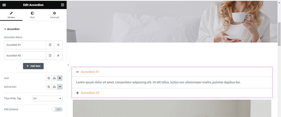
On the left panel, you’ll see the suite of Elementor widgets. Scroll down until you find the accordion widget. Drag and drop this widget onto your content section (Image 2). Now, feel free to customize it as you see fit.
I changed the titles to ‘My Title One’ and ‘My Title Two’ (Image 3).
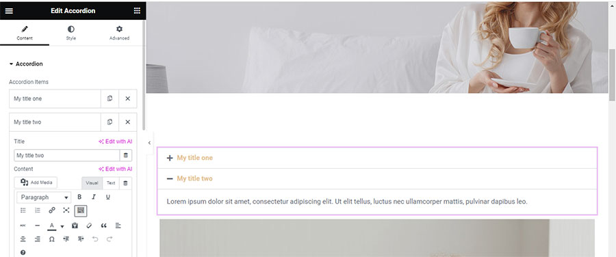
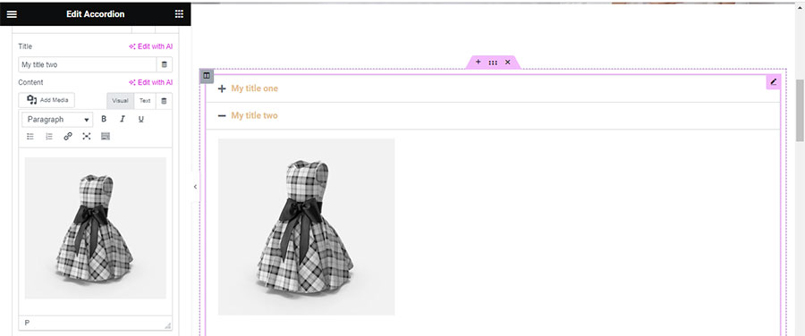
Notice that each accordion’s content area is a rich text editor. You can add text, media, or both by clicking the ‘Add Media’ button. For variety, let’s add text to the first accordion and an image to the second (Image 4).
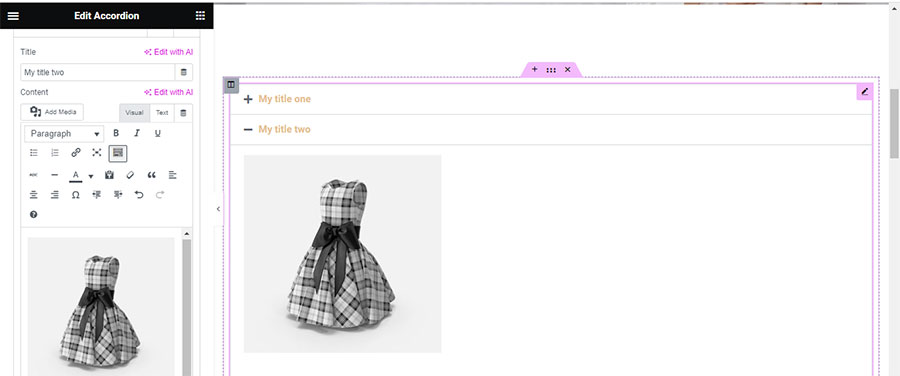
By pressing the ‘Toolbar Toggle’ button, you’ll uncover additional formatting tools for your content (Image 5).
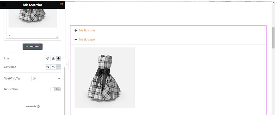
Underneath, you have the power to remove, change, or upload your own icon. However, I suggest leaving it as it is unless you have specific preferences (Image 6). You can also alter the HTML tag of your title. You can change it from div which is the default tag to a heading. Whatever you choose avoid using H1 since it is nornally used for the title of your page and it could mess up your SEO.
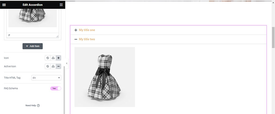
If you’re using your accordion as an FAQ schema, remember to activate the button below (Image 7). Doing so provides search engines like Google the necessary information to categorize this part of your page as an FAQ section.
In terms of styling, the Accordion widget allows you to adjust the border width, color, font, size, color of the title and content, and the alignment, color, active color, and spacing of your icon (Image 8). Adjust as needed and remember to click ‘Update’ regularly to avoid loss of changes due to unforeseen circumstances like a sudden power outage. It has happened to me. I am not joking.
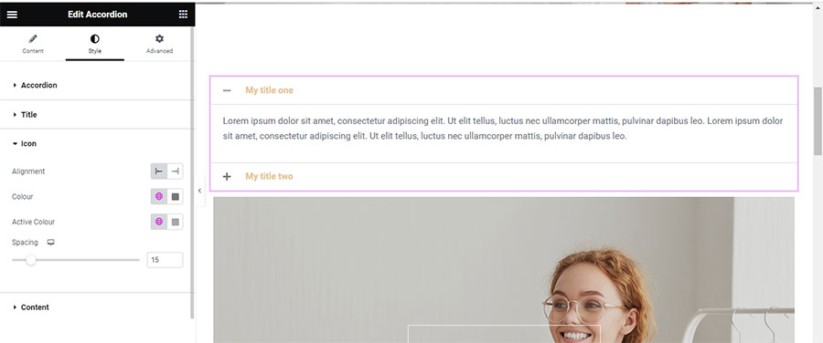
Next, let’s add the sibling widget to the accordion – the toggle widget (Image 9).
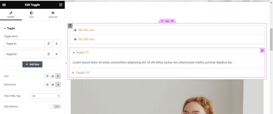
Its content tab mirrors the Accordion, but its style tab offers additional adjustments like ‘Space Between’ and ‘Box Shadow’ (Image 10).
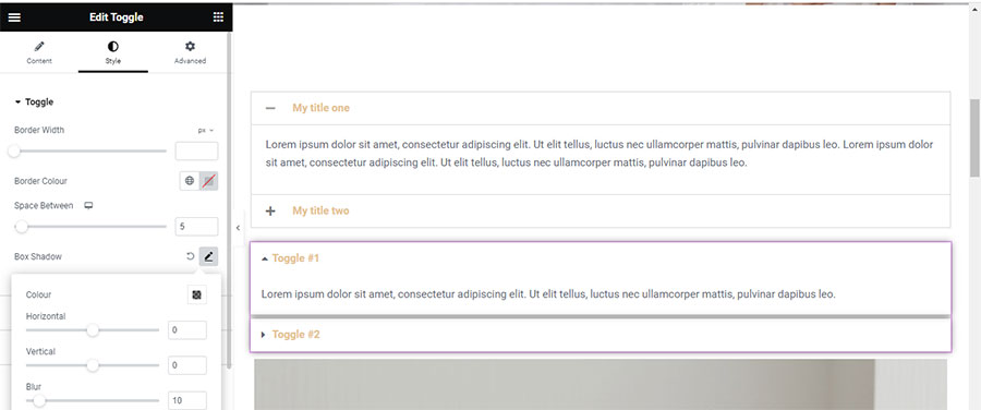
Hit ‘Update’ again to save your changes.
So, what distinguishes these two widgets?
Accordion vs Toggle: Key Differences
The Accordion widget, when clicked, expands to reveal its content while collapsing all other sections. It’s ideal for presenting large content volumes like FAQs or product details in a confined space. Upon page load, the first item is expanded, with all other items remaining collapsed.
In contrast, the Toggle widget allows multiple sections to be expanded simultaneously. It’s beneficial for users who wish to compare content from different sections. Unlike the Accordion, all Toggle widget items are collapsed when a page is loaded.
Having understood the Accordion and Toggle widgets, let’s dive into the Tabs widget.
Locate the Tabs widget in the Elementor widgets area and drag it onto your content area (Image 11).
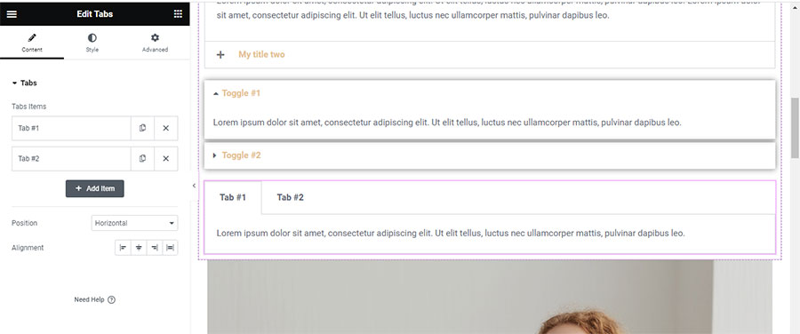
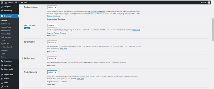
This widget version does not include nested elements. To enable them, go to Elementor —> Settings —> Features and activate the Flexbox Container and Nested Elements (Image 12). We will discuss Nested Elements Tabs in our upcoming tutorial.
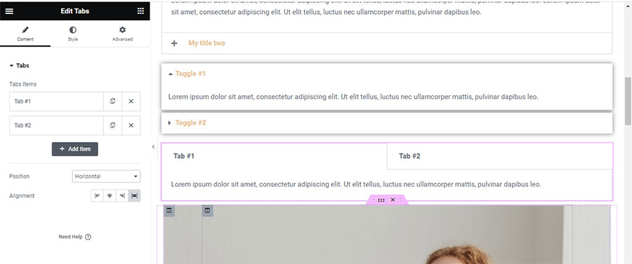
On the Content tab, you can choose your tabs’ alignment and whether to display them vertically or horizontally (Image 13).
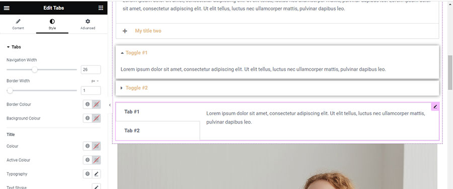
For vertical displays, the Style Tab provides an additional option to set the navigation width, which determines the tabs’ width in comparison to the content (Image 14).
So, how does the Tabs widget differ from the other two widgets?
Understanding the Tabs Widget
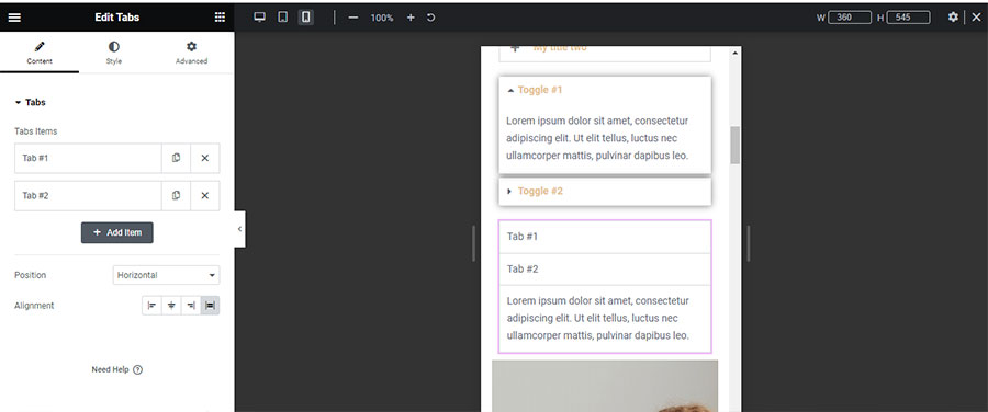
The Tabs widget is best used when categorizing content and facilitating easy navigation without scrolling. Especially with horizontal tab displays, users can view a larger part of the content without scrolling – a huge advantage in certain cases. Like the Accordion, the first tab’s content is visible upon loading. However, unlike the Toggle, all tabs cannot be active and open simultaneously. On mobile devices, it operates more like the Accordion, with the first item open and active, and other tabs closing when a new one is selected (Image 15).
Now you’re well-versed with the Accordion, Toggle, and Tabs widgets. Choose wisely based on the type of content you wish to present, and make the most of the suitable widget. Live long and prosper in the digital and physical world, and stay tuned for our next tutorial.


