Carousel with Nested Elements was introduced with Elementor 3.14, expanding the nested element widget collection, which already included Tabs and Menus. This new widget is a part of Elementor Pro and allows you to nest elements within each carousel slide, providing a platform for unlimited design creativity.
Let’s break it down and also see how it augments the design flexibility in Elementor:
Nesting Capabilities
- The Nested Carousels widget utilizes Containers to allow the addition of content to each carousel slide, which opens up countless design options.
- Each slide in the carousel becomes nestable, meaning you can drag and drop any widget into it, effectively creating a carousel within a carousel.
Customization
- The widget offers a wide range of customization options to make your content stand out. You can adjust the background, styling to match your brand’s style, and easily add buttons and other interactions to engage your visitors.
Activation
- To use the Nested Carousels widget, you need to activate the Nested Element feature by navigating to WordPress Dashboard → Elementor → Settings → Features. If your website has the previous layout of Sections you also need to activate Containers from Features.
Replacement for Existing Widgets
- The Nested Carousels widget can replace several existing widgets such as Image Carousel, Media Carousel (Pro), Testimonial Carousel (Pro), and Reviews (Pro), all of which came with a predefined layout and had limited content and customization options.
Ease of Usage in Editor
- To facilitate the drag-and-drop into each slide, the Autoplay and Infinite Loop features have been disabled in the Editor, although these features remain available and functional on your live website and in Preview mode4.
Creating Engaging Experiences using Carousel with Nested Elements
- You can create captivating experiences by adding a background image and a video overlay to a slide, enabling the creation of 3D-like effects.
This Nested Carousels widget significantly elevates the way content is showcased on websites, providing more versatility and a comprehensive solution for creating engaging user experiences.
Now let’s see the Nested Carousels Widget in action. You can view this tutorial also by watching the video below.
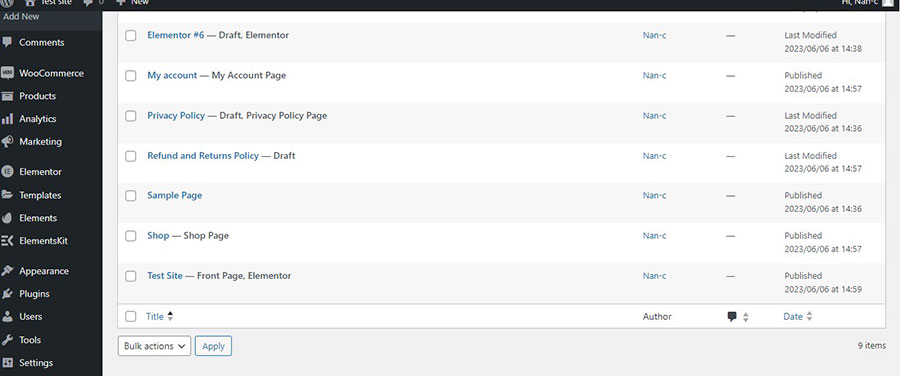
For those who prefer to read first we head to the dashboard, click ‘Pages’, and then I will choose my homepage and click ‘Edit with Elementor’ (Image 1).
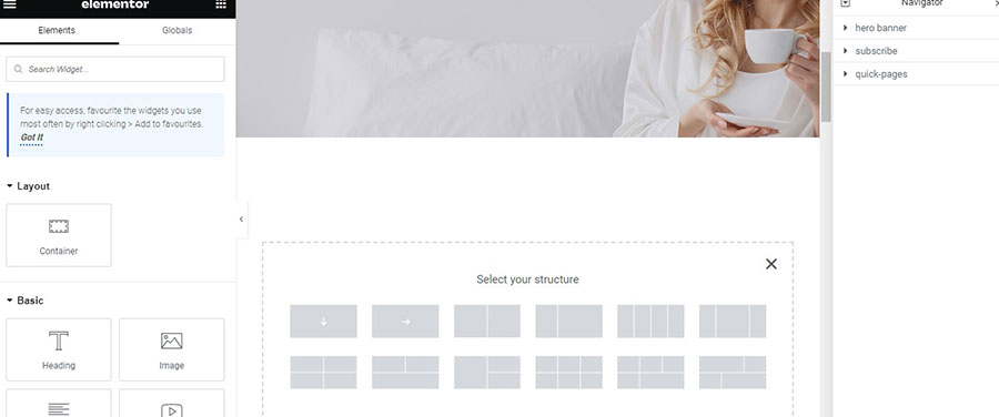
On the left, we see the Elementor widgets, and on the right, we have the page workspace. We add a new container above the Hero Banner. I choose the first suggested container structure (Image 2).
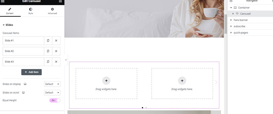
I go again on the widget sidebar and drag and drop the Nested Elements Carousel inside my Page workspace. We see that by default it has 3 slides which are also containers and you can add to each container from a widget to numerous containers (Image 3).
Now on the first slide I want to create a kind of 3D effect. So what is I go to the Slide#1 settings and on the style tab I choose Background and Video and inside the Video Link I paste the url of the video I want (Image 4).
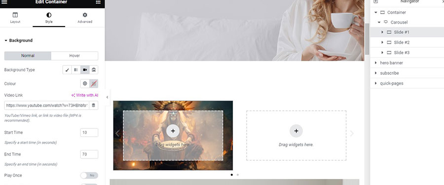
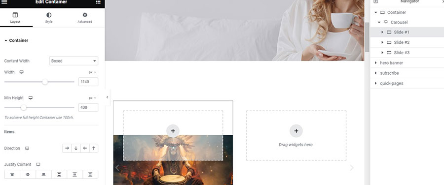
I leave everything else as it is. I also go to the Layout Tab and enter a Min Height of 400px (Image 5).
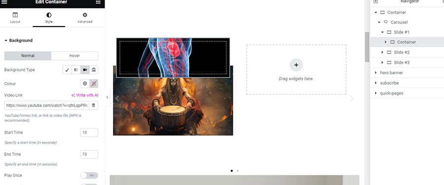
Inside the Slide#1 I drag another container. I go to the container style tab and I place another video background with the same way I did to the Slide#1 (Image 6).
I want the second video the appear in front of the first one. To achieve that first of all I go again to Slide#1 Advanced Tab and add a padding of 50px to all sides (image 7).
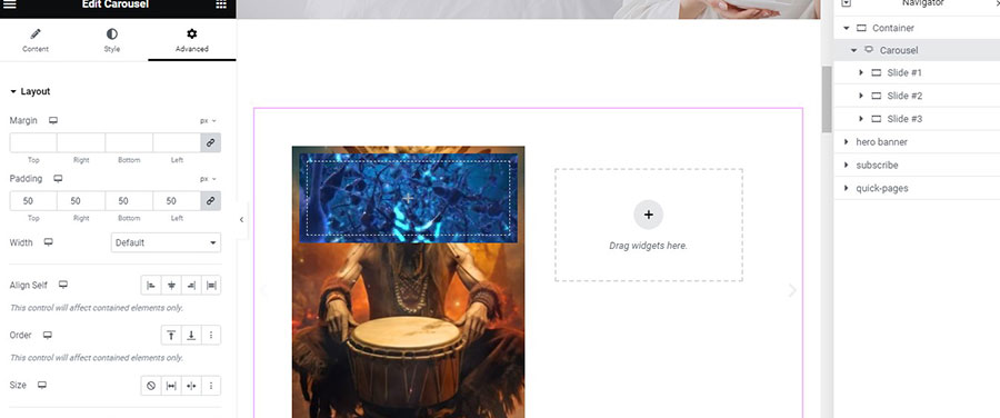
And then I go to my container Advanced Tab and head on to Size and choose Grow so the Container will be stretched to occupy all of the Slide leaving a 50px padding on all sides. Now we have a video playing in front of another video. If you choose the appropriates videos the result can be stunning.
Let’s head to Slide#2 and drag in there a Loop Grid. I go to the loop Content Tab and select a template from the ones I have already created (Image 8).
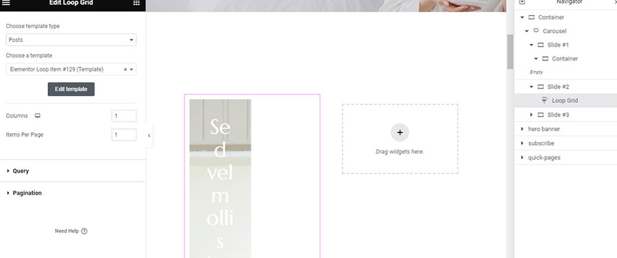
I choose 1 Column and 2 Items Per Page and leave all the other default settings unchanged.
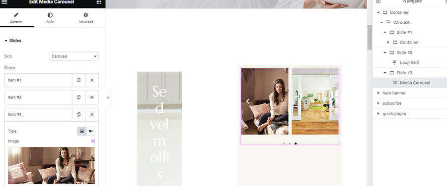
Now I click on Slide#3. I want to add there a Media Carousel. But first I will add a background color to the slide from the Style Tab. Then I drag the Media Carousel inside the Slide. I delete the two last Items.
Then I insert 3 photos to the remaining Items (Image 9).
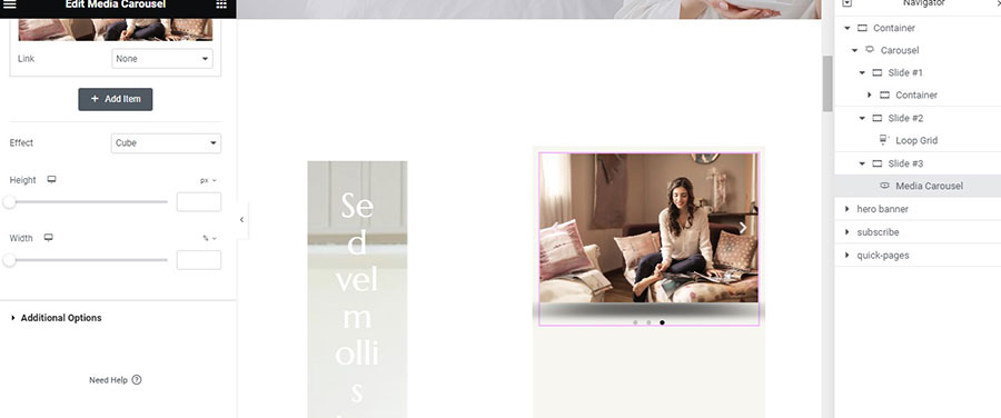
From the Effect setting I choose Cube (Image 10) to make it more interesting.
Now we have three Slides with three different content elements and also Slide#1 has a nested container which we have added.
The other settings for the Nested Elements Carousel are pretty much the same as the simple version. I choose 2 Slides on display and 1 Slide on scroll and I also want Equal Height (Image 11).
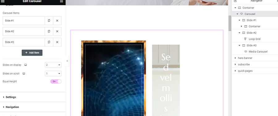
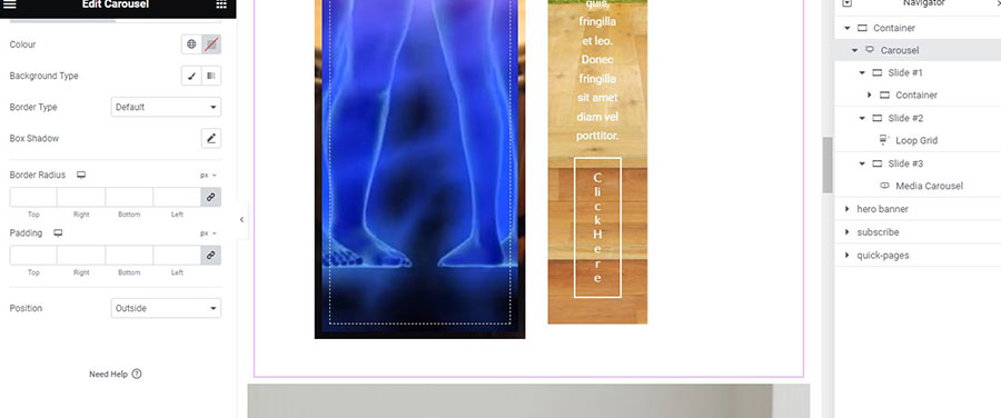
Then I go to the Style Tab to just place my Navigation Outside (Image 12).
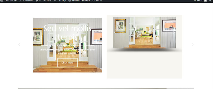
Now let’s have a preview to what we have created by hitting the Preview Icon (Image 13) which will take us to a new tab to see our page without having to save it.
The New Nested Elements Carousel is a pretty powerful widget and with the right use it can make wonders for your design and your website. Use it wisely and as always experiment.


