Brief Overview of the Elementor Loop Builder
The Loop Builder was first introduced in Elementor Pro 3.8 as a novel way to design and showcase your lists of posts, portfolio, and general listings. It provides greater flexibility than the post and portfolio widgets because it allows you to design the loop item from scratch.
See this tutorial in YouTube
Understanding the Basics
Basic Elementor Skills Required
To use the loop builder, you must have the pro version of Elementor. You can aquire it by clicking here. A basic understanding of how the Elementor builder works will be helpful, but I will also provide all the essential steps to create your own loop here.
Loops in Elementor
Loops in Elementor represent repeating content such as posts and portfolios. The loop builder is now available to help you customize the appearance of these listings. Until now, we had predefined designs by the posts and portfolio widgets, but now you get to have total control over the loop’s appearance.
Loop Carousel and Loop Grid
Loop Grid
The loop grid is a widget that you can use to incorporate your loops into the page you want. However, instead of editing its design after you have placed it on your page, the loop grid will prompt you to select one of the loop templates you have created, or you can start from scratch to design your loop.
Loop Carousel
The Loop Carousel was introduced with Elementor 3.11. It provides an alternative way to display your loops on the desired page. It is similar to the loop grid, but instead of displaying your posts as a grid, they are shown in the form of a carousel. Here too, you can choose one of your pre-created templates or start building from scratch.
Getting Started with Loop Builder
Where to Find the Loop Builder
You can access the Loop Builder in two ways: either by going to Site Parts or from within the Elementor Builder. Let’s examine both methods.
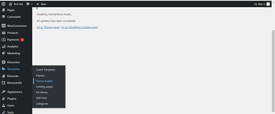
From Site Parts: As depicted in the image below, we go to ‘Templates’ on the left sidebar of WordPress and then choose ‘Theme Builder’.
When ‘Theme Builder’ opens, we move to the left sidebar there and click on ‘Loop Item’ (Thumb 2).
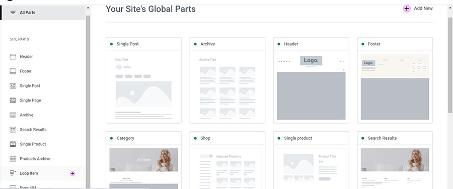
This action opens the Loop Editor.
From inside Elementor: The Loop Builder is accessible from anywhere you want. Let’s just say, for example, we want to create a loop for our home page. We go to ‘Pages’ and select our homepage. We click on ‘Edit with Elementor’ and in the Elementor editing area, we proceed to our widgets as shown in the image below (Thumb 3), choosing either ‘Loop Grid’ or ‘Loop Carousel’.
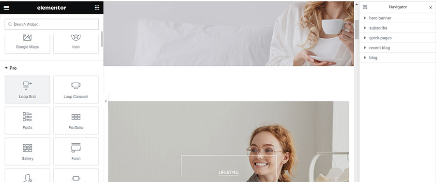
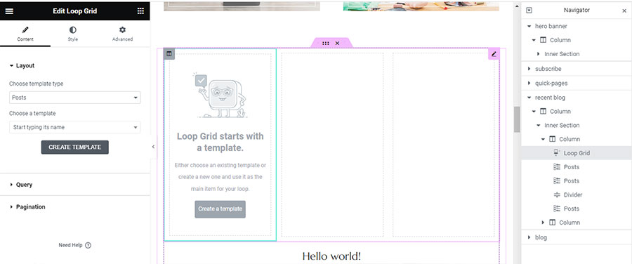
For this example, I will use the ‘Loop Item’. So, I drag and drop the ‘Loop Grid’ widget into the editing area on the right. As depicted in the image (Thumb 4), a prompt appears inside the Loop Grid, inviting us to click on the button and create our first template.
How to Create Your First Loop
Let’s create our first loop by clicking on ‘Create a Template’. A message first appears, asking if we want to save the changes we have made to the page. I click ‘Yes’. A new editing area appears inside the page we are on, helping us better understand our loop’s position within the page (Thumb 5).
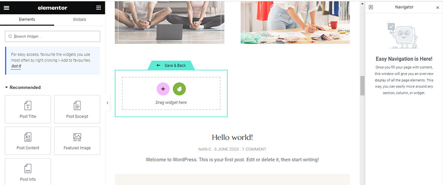
I will use a ‘Call to Action’ widget to create a custom loop. I drag the widget from the widget area to the box on the left that says ‘Drag widget here’ (Thumb 6).
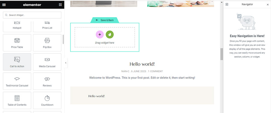
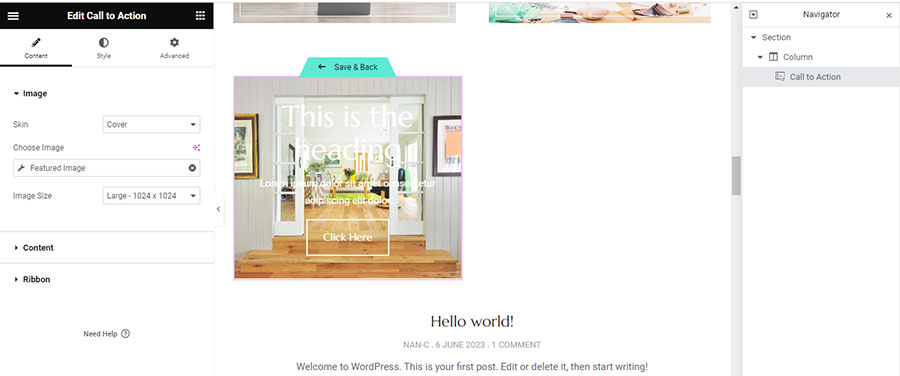
I select ‘Cover skin’ because I want a more visually striking look for my loop than what the standard posts widget offers.
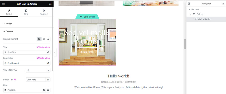
From the widget settings, I opt to use the featured image of my post for the call-to-action image, for the title I select ‘Post Title’, for the description I select ‘Post Excerpt’, and I link the button to the ‘Post Url’ (Thumb 7).
Once our widget is ready, I click ‘Save and Back’ to preview it (Thumb 8).
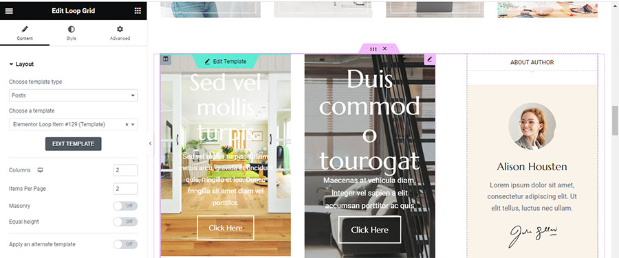
I make some adjustments to enhance its appearance on the page and set Columns to 2, Items Per Page to 2 (Thumb 9). The outcome is quite distinct from the usual appearance we achieve with the Posts widget.
Diving Deeper into the Loop Builder
Advanced Features and Customizations of the Loop Builder
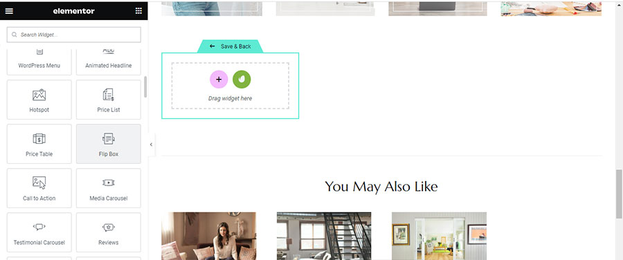
What if I want a more advanced design for my Loop? I access the Loop Builder following the same steps I have already mentioned. But this time, instead of dragging a ‘Call to Action’ widget, I will use a flip box as shown in the image below (Thumb 10).
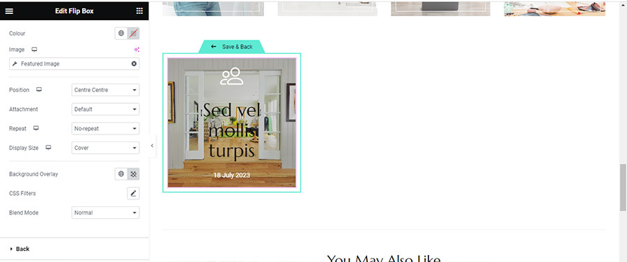
I navigate to the flip box settings on the left, and within the front section, I click on ‘Icon’ and ‘Icon Library’ to select a different icon from the default one. For the title, I select ‘Post Title’, and for the description, I choose ‘Post Date’ to display the day the post was published. I go to the ‘Background’ tab, select ‘Dynamic Tags’ and then ‘Featured Image’. I set the position to ‘Center Center’, ‘No-Repeat’, and ‘Cover’ as the Display Size. To make the content more readable, I add a Background Overlay (Thumb 11).
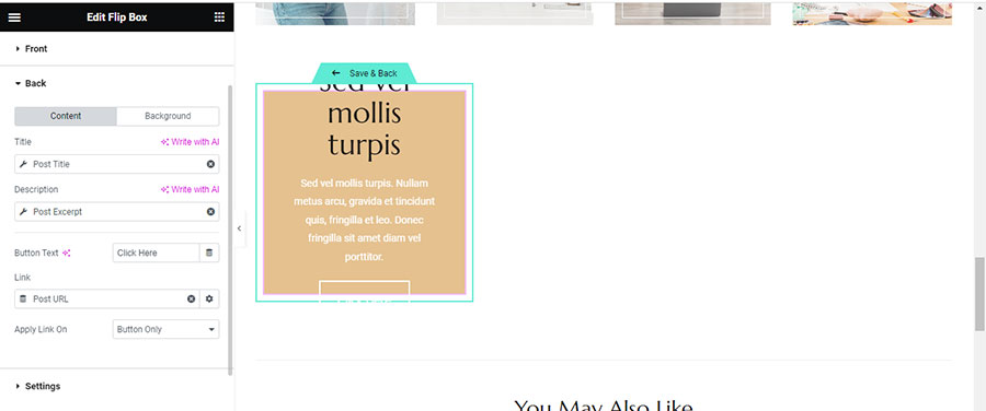
Now let’s proceed to the back settings. I again choose ‘Dynamic Tags’ and ‘Post Title’ for the title, and this time, for the description, I select ‘Post Excerpt’. I navigate to ‘Link –> Dynamic Tags’ and select ‘Post Url’ (Thumb 12). If desired, I can change the background to my preference.
I also need to adjust the height because it seems necessary to increase it. I go to ‘Settings’ and set the height to 400px (Thumb 13).
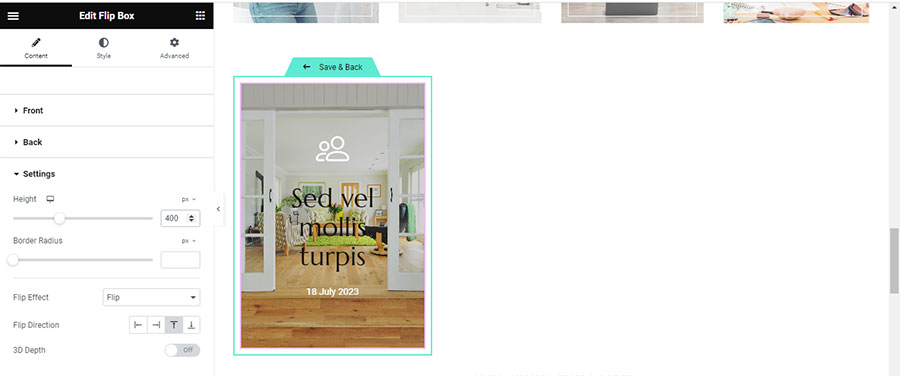
So now, I have designed my loop as a flip box.
Working with the Loop Grid
Setting Up the Loop Grid
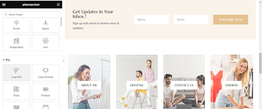
Now let’s see how we can insert our loop into our page with the Loop Grid. We go to the page where we want to use the loop and click ‘Edit with Elementor’. Then we navigate to the part of the page where we want to add the loop, and drag and drop the Loop Grid from the widgets on the left (Thumb 14).
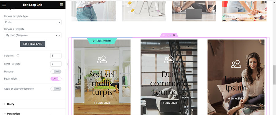
We proceed to the loop settings and inside the ‘Choose a Template’ field, we type the first letters of the loop we want to insert. The loop is then inserted into the Loop Grid. From here, the settings are similar to the Posts Widget. We can choose how many columns our grid will have, the number of posts per page, whether we want to apply Masonry, and if the loops will have an equal height. I opt for equal height, and leave the other settings as they are (Thumb 15).
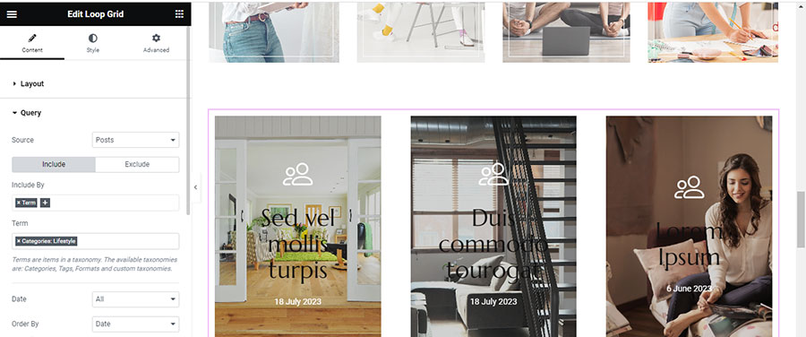
You can also set the source of your loop. Do you want Posts, Pages, or to manually select the content you desire? I chose Posts from a specific category as depicted in the image below (Thumb 16).
Utilizing the Loop Carousel
Setting Up the Loop Carousel
If we want to use the Loop Carousel to showcase our posts, we drag and drop the Loop Carousel widget onto the workspace, as shown in the image (Thumb 17).
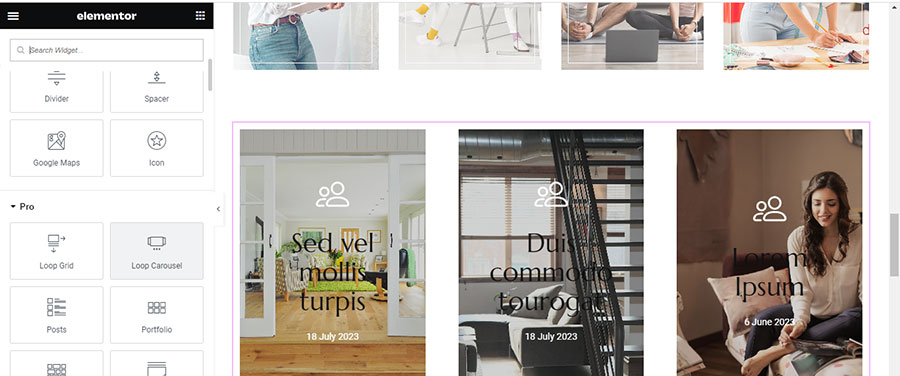
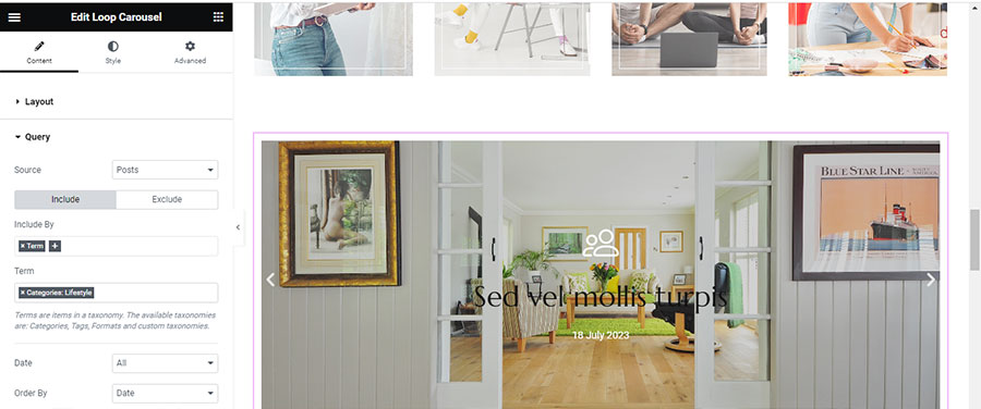
We select the Template we want to insert into our Loop Carousel and adjust the settings. I want each slide to display one post at a time and a total of three posts to be visible. I adjust the Query settings as I did with the Loop Grid (Thumb 18).
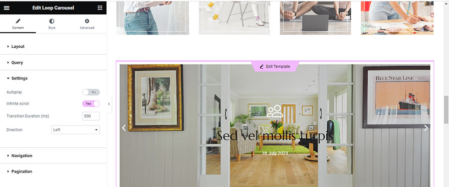
The settings below the query concern the motion of the Loop Carousel. I leave them as they are but decide to deactivate the Autoplay feature (Thumb 19).
You can also customize the navigation by changing the icons (Thumb 20) and determining how you want your navigation to be displayed.

Customizing the Loop Carousel
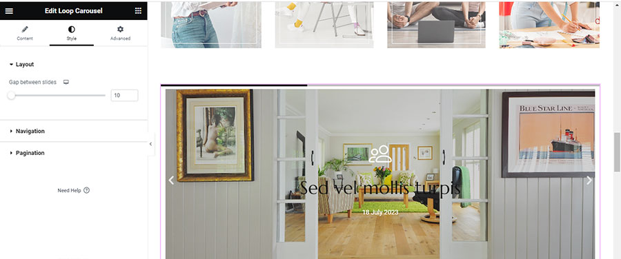
For style settings, I click on the Style tab, where I can set the gap between slides (Thumb 21), style the navigation by changing the size, color, and position (Thumb 22).

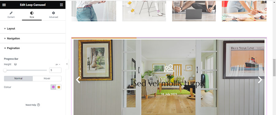
I can also modify the pagination, depending on the type I have chosen from the Content Tab. For this example, I have chosen ‘Progress’, so I can adjust the height of the Progress Bar and the color (Thumb 23).
Tips and Best Practices for the Loop Carousel
It’s generally preferable not to use the Loop Carousel more than once on a page, as the scrolling can be distracting for the user. We should use it if we want to emphasize a query, for example, on a news site, we can place it at the top to display the featured or latest news.
In a future tutorial, we will delve into using the Loop in more advanced ways with custom designs for posts and products. Stay tuned!


