In life, all things evolve. How could two small but powerful Elementor widgets like Tabs and Accordions escape this universal law? Well… spoiler alert. They didn’t. Let’s examine them both thoroughly with their newly acquired superpower of nested elements.
You can watch this tutorial in video form below
A basic understanding of WordPress and Elementor is useful for this tutorial, but no worries. I will provide all the necessary steps to unlock the power of Tabs and Accordions, the evolved nested tabs version. You don’t need Elementor Pro since both widgets are available with the free version of Elementor.
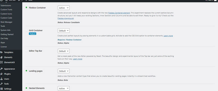
In order to energize the new superpowers of Tabs and Accordions, we need to enable the Flexbox Container and the Nested Elements from the Features of Elementor Settings. So, after we have logged in to our Dashboard, we go to Elementor —> Settings —> Features, check the Flexbox Container and also the Nested Elements (Image 1).
Accessing the Widgets
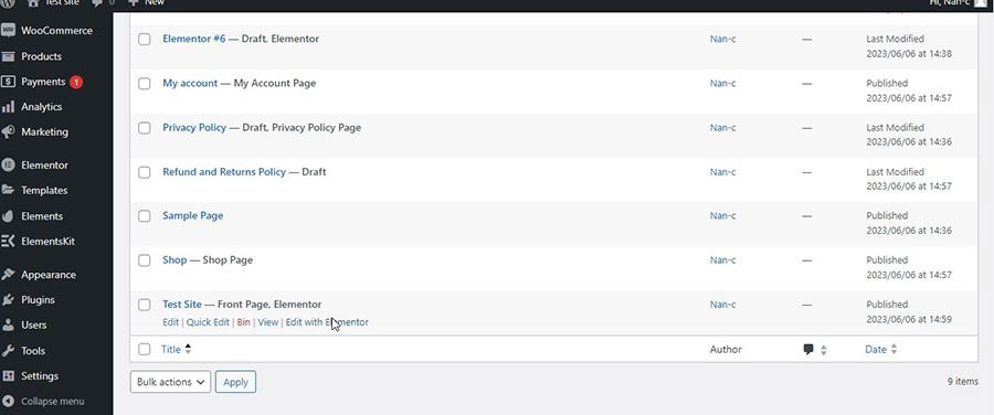
If you have been reading one of my previous tutorials, you will know the drill. If not, then let’s head to the dashboard, click Pages, and then I will choose my homepage and click ‘Edit with Elementor’ (Image 2).
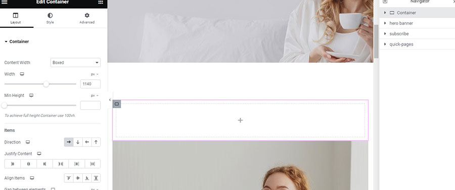
On the left, we see the Elementor widgets, and on the right, we have the page workspace. We add a new section above the Hero Banner (Image 3).
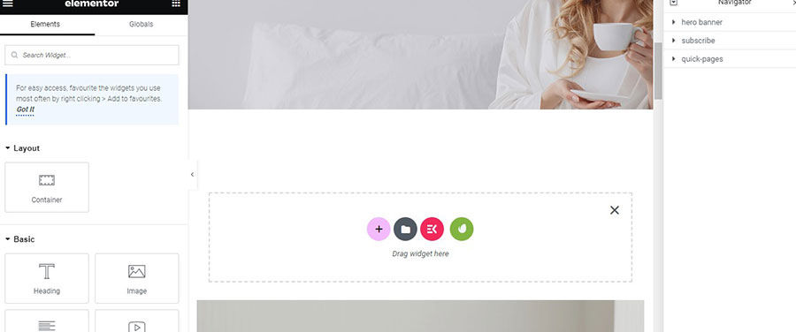
We then add a container inside that section (Image 4).
The New Nested Elements Tabs Widget
We scroll down until we find the Tabs widget and drag and drop it inside the container.
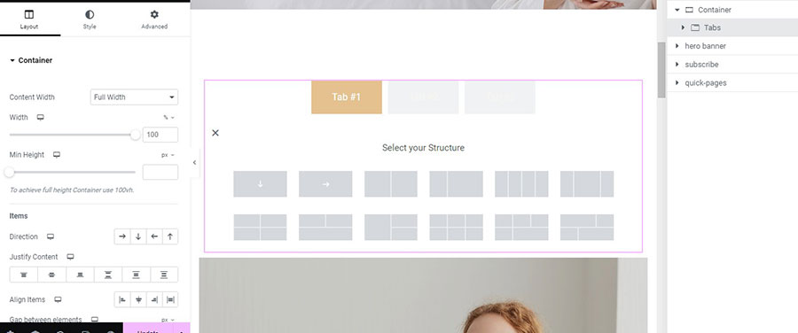
We already see the difference. Instead of the Rich Text Editor of the previous version, we now have a container. And that means we can create more complex designs. Tab #1 is already selected, so I click inside the Container and choose the Structure I want (Image 5).
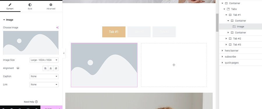
I have chosen to insert two containers. On the left one, I add an image by either clicking inside the container and then choosing the Image widget from the left or by directly dragging and dropping the Image widget on the container (Image 6).
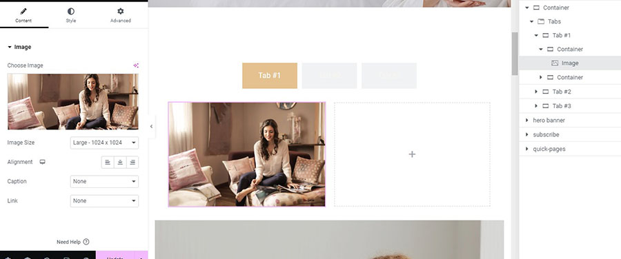
I choose the image I want (Image 7).
On the right container, I add a heading and change the text of the heading (Image 8).
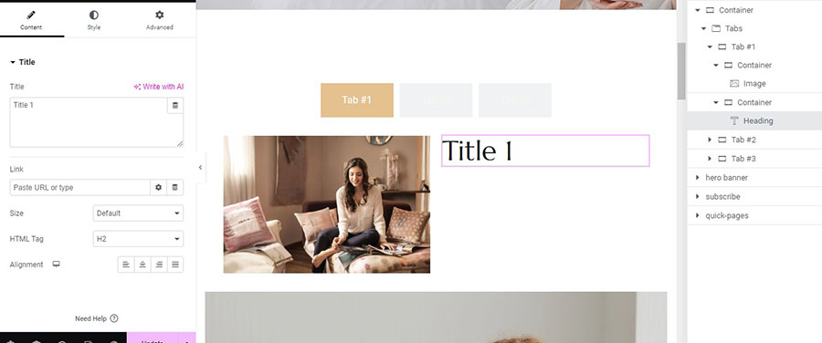
Afterwards I add a text editor below the heading and change the text to the one I want (Image 9).
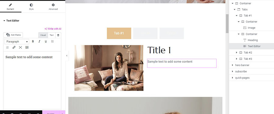
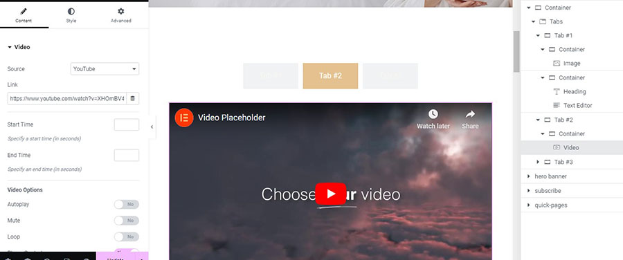
I click on Tab #2 and drag and drop a Video widget there. Elementor will automatically add the container (Image 10). I add the URL of the video I want.
Now I go to Tab #3. Just to show the depth of complexity you can add here, I will drag and drop a second Tabs widget inside here (Image 11).
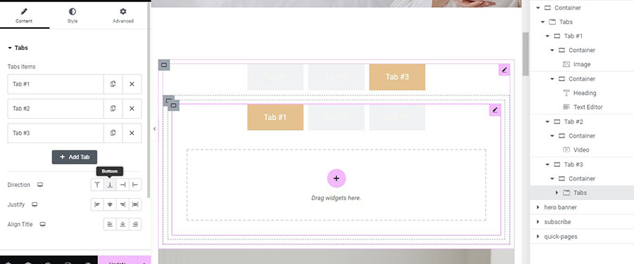
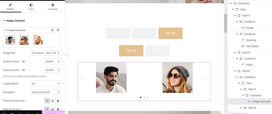
I will delete the third tab and add to the first one with the same steps I followed before an Image Carousel widget, and I will insert three photos there (Image 12).
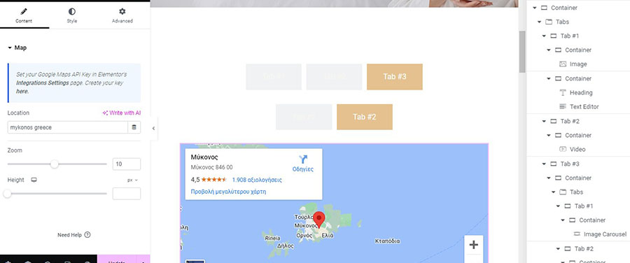
Inside the second tab, I will add a Google Maps widget and change the default address to Mykonos, Greece, which is the hottest destination for summer holidays in Greece (Image 13).
Settings for the New Nested Elements Tabs Widget
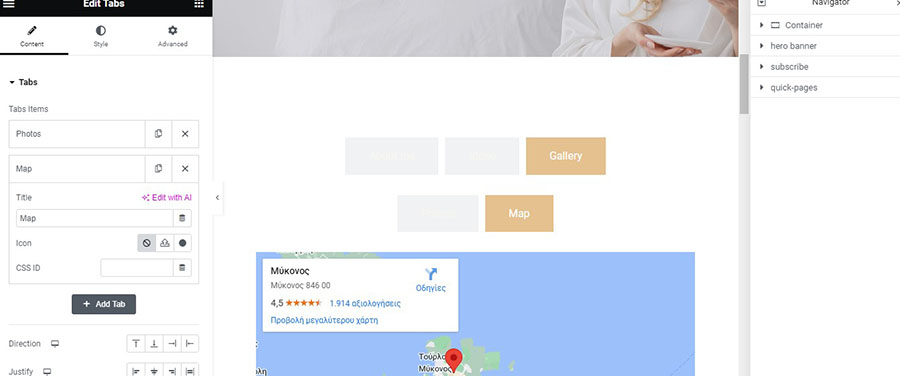
As we see on the Content tab on the left, we can change the titles of the Tabs, and I will do that right away by changing also the title for the nested second Tabs widget (Image 14).
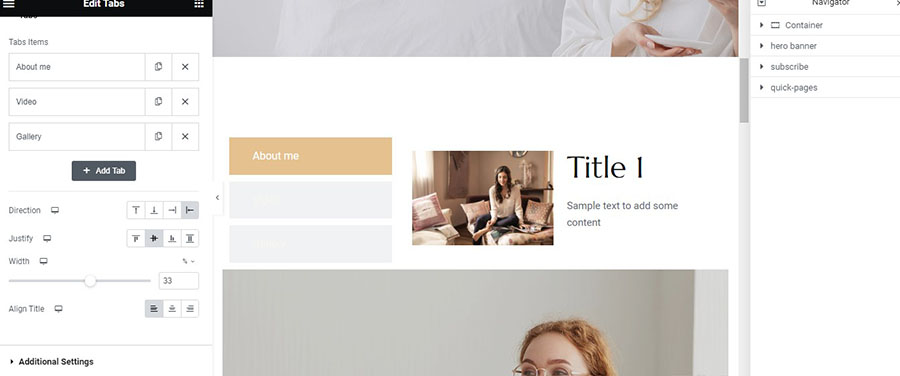
I will change the Direction of my tabs and place them on the left and also justify them to the center. I will then modify the width of the tabs to 33% and align my title to the left (Image 15).
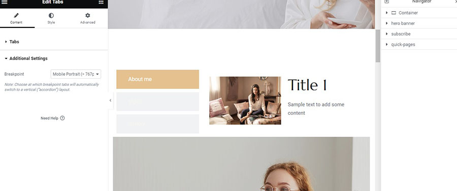
Below, I will leave Additional Settings unchanged because I want from the Mobile Portrait breakpoint to have my tabs switched to a vertical “accordion” layout (Image 16).
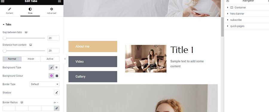
Let’s now see the Style tab. I will modify the Gap between Tabs to 20 and Distance from Content to 20 also. I will change the Background Type on the Normal State because I cannot see my titles and leave the others as they are. I leave the other settings as they are and head to the Titles section (Image 17).
I will only change the Typography there to H5 (Image 18).
And I will go to the icon settings, set the Spacing of the icon to 30, and leave everything else unchanged (Image 19).
Finally, I will visit the Content Section of the Style tab and change the Background Colour there to a light grey (Image 20). Now our new evolved Tabs widget with nested elements is ready to fly in space and beyond.
The New Nested Elements Accordion Widget
Since Elementor 3.15 and with the prerequisite that you have enabled the Flexbox Container and the Nested Elements from the Features of Elementor Settings, as you have already mentioned at the beginning of this tutorial, you can use the new Nested Elements Accordion widget. Let’s see more about the new superpowered Accordion.
We insert a container above the hero banner (Image 21).
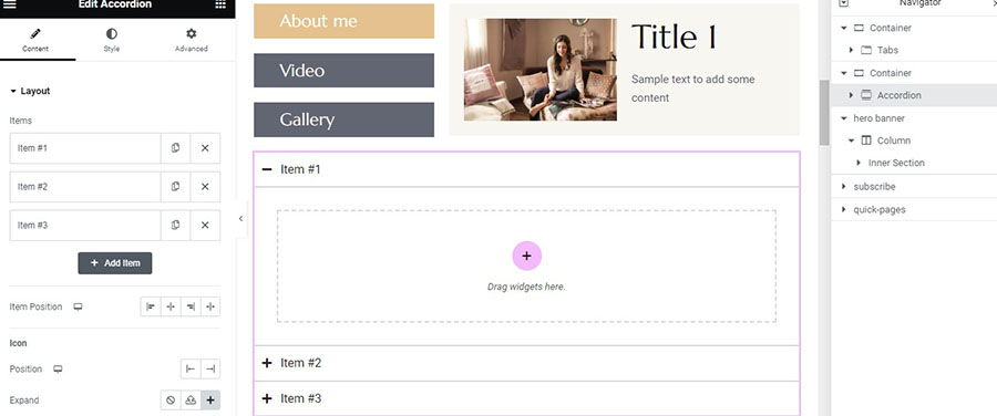
Then we drag and drop the accordion widget there (Image 22). The functionality of the containers is exactly the same as the new Nested Elements Tabs widget.
Settings for the New Nested Elements Accordion Widget
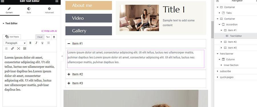
I drag and drop a text widget on the first container and just duplicate the dummy text to see what it’s like to have more content (Image 23).
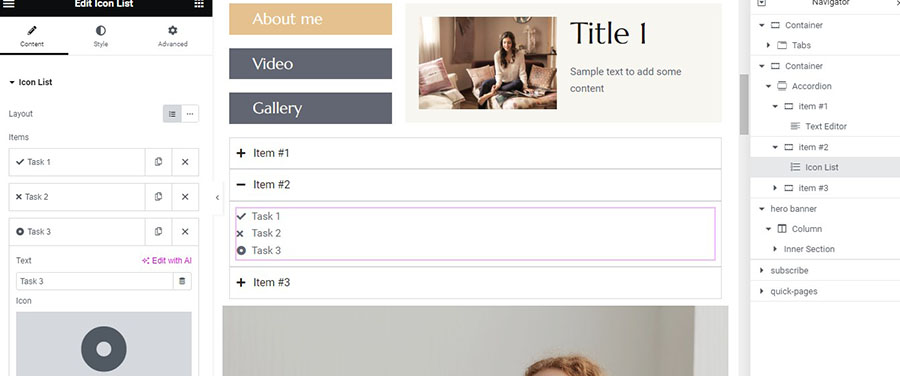
I add an icon list and change the text a little bit on the list items. I leave everything else as it is (Image 24).
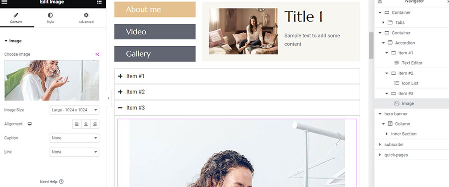
And inside the final container, I add an image widget and insert the image I want from the library (Image 25).
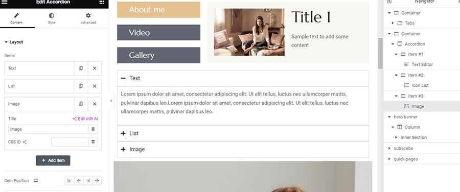
Let’s also change the header titles to ‘Text’, ‘List’, and ‘Image’ accordingly (Image 26).
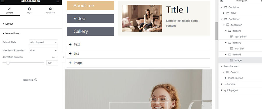
I leave the settings about the ‘Item Position’ and ‘Icon’ as they are and head to the ‘Interactions’ below. We see here that unlike the previous version, we can change the ‘Default State’ and so I choose ‘All collapsed’. We now also have the ability to change the ‘Max Items Expanded’, but I am going to leave that as it is (Image 27).
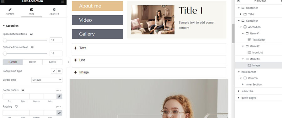
Let’s head now to the ‘Style’ tab. I will change the ‘Space between Items’ and ‘Distance from content’ to 10 (Image 28).
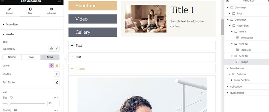
Now we go to the ‘Header’ and just change the color of the ‘Hover’ and ‘Active’ states and leave everything else as it is (Image 29).
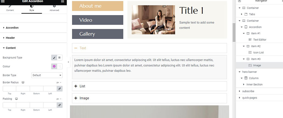
On the ‘Content’, I will change the Background Type to a light grey and hit ‘Update’ so we don’t suffer sudden losses. Our new Nested Elements Accordion widget is ready (Image 30)!
What is important to remember here is that you cannot use the Accordion with the Loop widget because nested elements do not work with looped repetitive elements.
Besides that, it is a great upgrade for both widgets, which opens almost limitless possibilities. So don’t be afraid to experiment and create amazing layouts!

